1980s PHILIPPE B. PURE SWAGGER
A chill-complex, visuals-forward "FOR SCALE" issue within a f*cking chaotic, heart-wrenching, mystifying politic*l hellscape. PLUS: the THONET SCENE !!!
*HIGHLY VISUAL TODAY* 👀
ON THE DOCKET: PHILIPPE BOISSELIER; COMME SI and U.S.M.; THONET CHAIRS HYPER ADAPTABILITY; NON-“ARK” SYMMETRY
Dear Snoops,
If you are in the United States, as are we, well — f*ck. You’re probably clenched, as are we.
And so today, a completely insufficient moment of chill. This is not m*n*malism – which, in fact, is often very FRUSTRATING (opposite of Chill) because it is a décor which tends to Hide itself. As an outsider to any M*n*malist décorscape, without intimate knowledge of said particular homescenario, m*n*malism is decidedly intimidating. Where the f*ck is anything?
THE “FOR SCALE” P.O.V. ON MINIMALISM, in brief
M*n*malism is cast as SELF-DISCIPLINE (GREG McKEOWN) and a path to PRODUCTIVITY (the poison Sisyphean “motivator” of capitalism!); or as a way to “BE MORE” and “MAKE ROOM FOR JOY” (MARIE CONDO), but… these folks will also try and sell u a ton of sh*t right after u through most of it out.
IN SHORT: it’s a f*cking grift, unless like, you reeeeeeeeeally feel that’s u. (Very few Genuine Minimalists out there, to be frank.)
And, we f*cking hate grifters.
Instead, be PHILIPPE B. ?
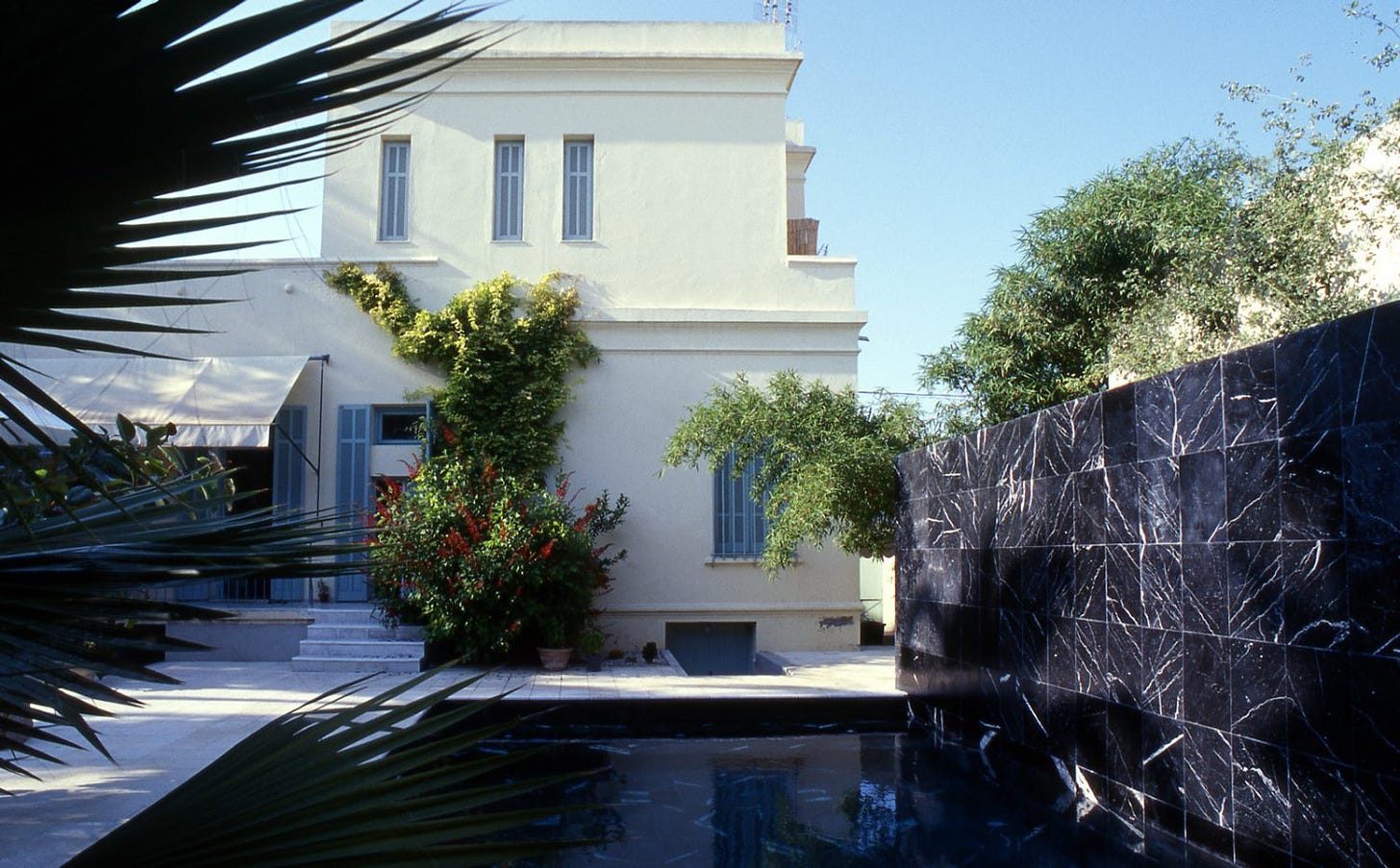
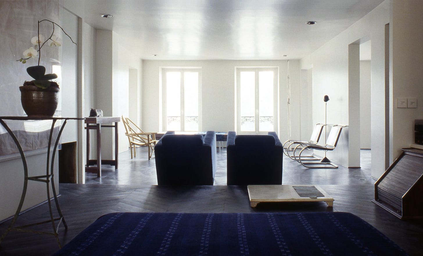
Instead, we’re in the headspace of Franco-”STRIPPED BACK”, very CHILL archi-décorator PHILIPPE BOISSELIER. For e.g., this 1988 Tunisian dreamy super residence that is a full late-90s-early-00s precursor, unveiled to us care of MAX R.’s newsletter. (← For us, worth the $)
Some things to say:
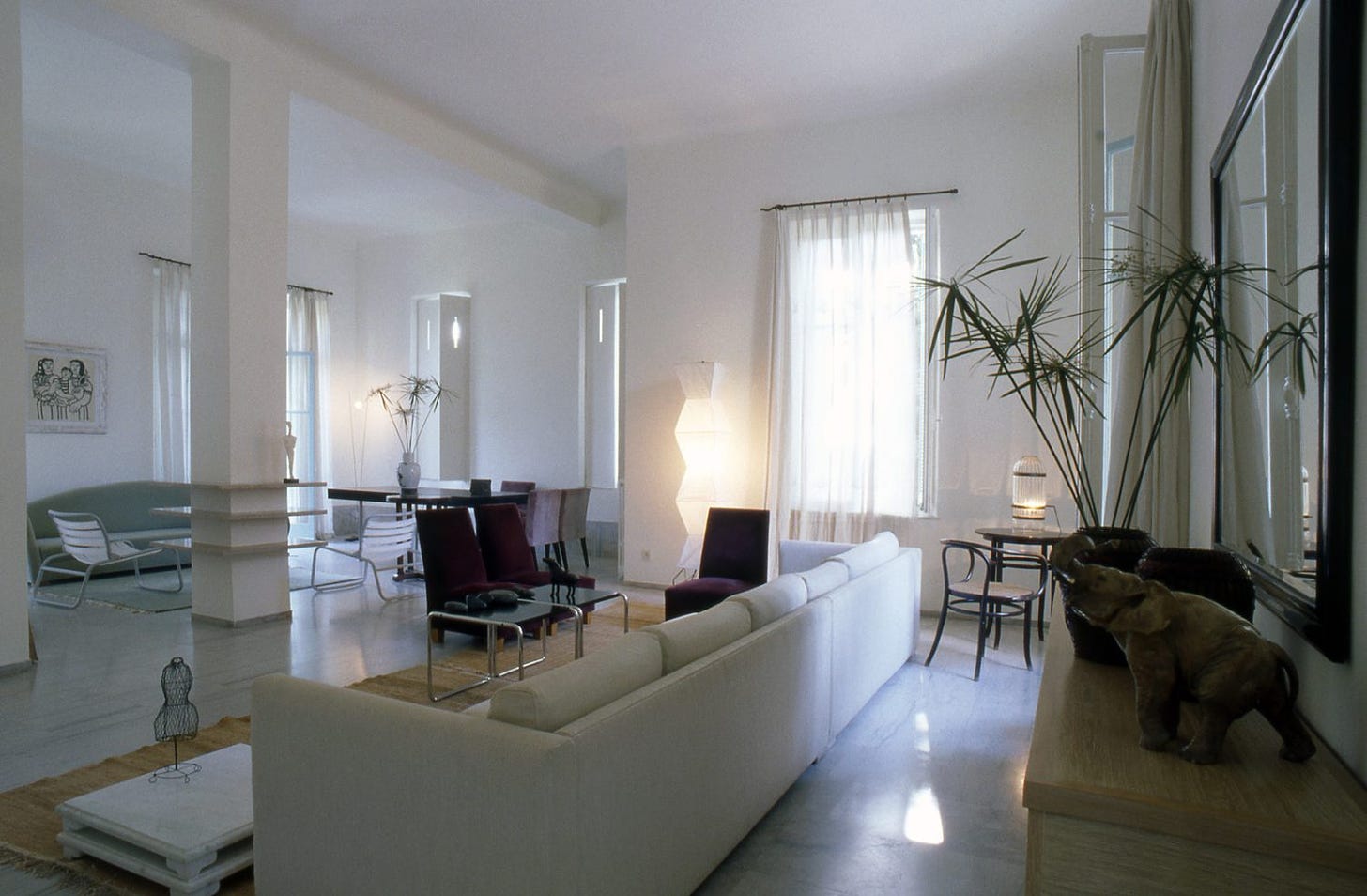
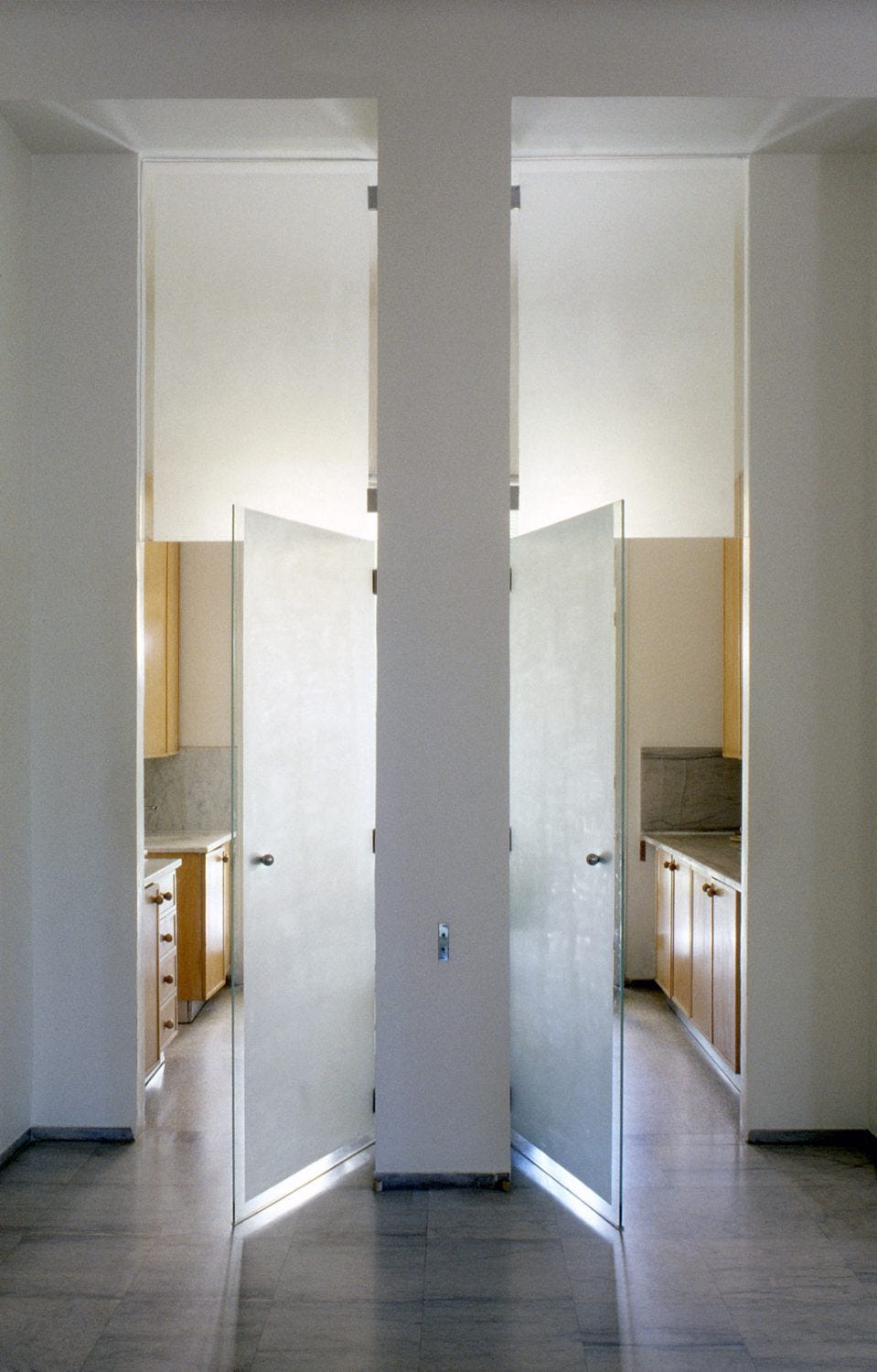
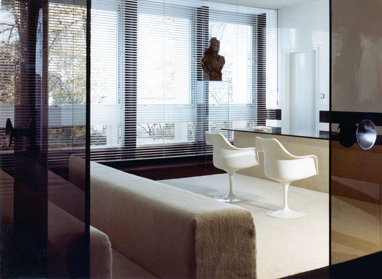
There is a lot of doubling here (see images above and below) and not in a kind of Desperate Symmetry or “NOAH’S ARK”1 kind of way. Those was are crutches, like “LET’S PUT TWO AND IT’LL FEEL WAY MORE BALANCED!” It’s often often doesn’t work.
ABOVE → a double-length sofa, should you have the space. (As does scratch-artist CY TWOMBLY in Rome.) We appreciate “ALTERNATIVE SOURCES OF TENSION!!!”, one being here: seemingly dividing two spaces by one thing that you would expect to unite them. Yet, here we have SOFA PART 1: outward-oriented with low table; SOFA PART 2: inward-oriented conversational staging. One sofa, two settings.
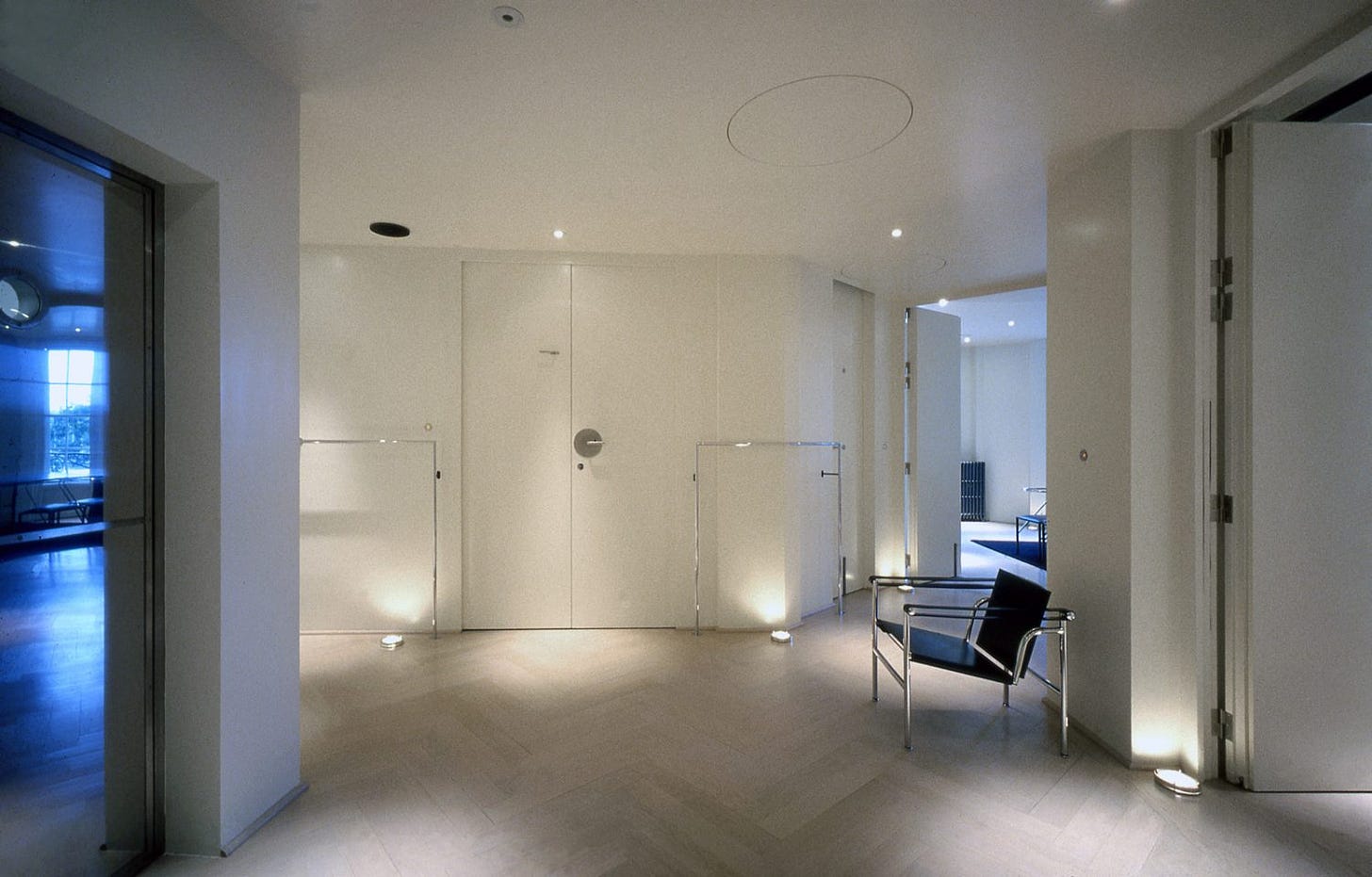
BELOW → Or, duplicity. Two entrances to two are-they-the-same? room(s). It’s symmetry not for Reassurance and Balance; it’s symmetry as disorientation – playfully so.
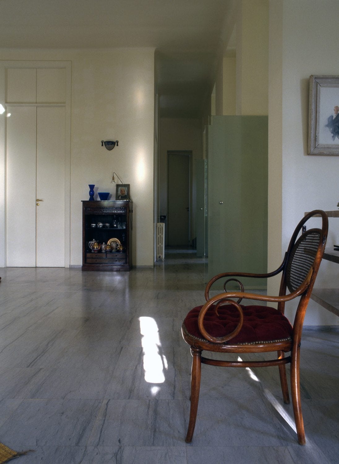
Also, to be so unafraid of EXPANSE as here!!!! (Below)
‘Tis rare to have big ‘ol spaces broken by moments of quite trad High Density such as that short shelf of things, rather than something chunky-simple and “sculptural” – another crutch. Sculptural is like, ok… you wanna eat up eye-space?
SECOND of all: deep appreciate for a Thonet or Thonet-adjacent bentwood. Absolutely one of things that is hardly every out of place!!! Esp. the rocker. May we expand:
T-H-O-N-E-T-S-C-A-P-E
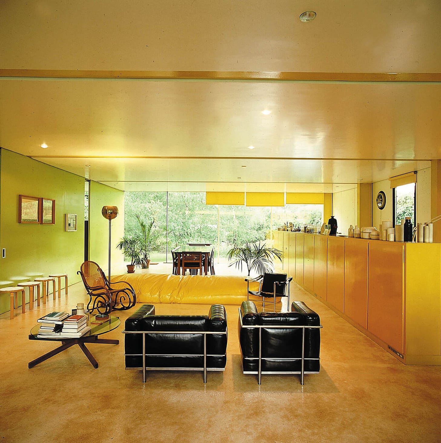
FOR EXAMPLE, Thonet rocker in previously-reported-on banana palace (color-wise) by Richard Rogers for his parents:
Hyper Sleak Corbusier chairs + slug-worm linear beanbag + row of Aalto stools, Etc. Et.cEt.c et.ce.e - STILL cannot keep up with magnetic force of Thonet, without that Thonet f*cking up the vibe.
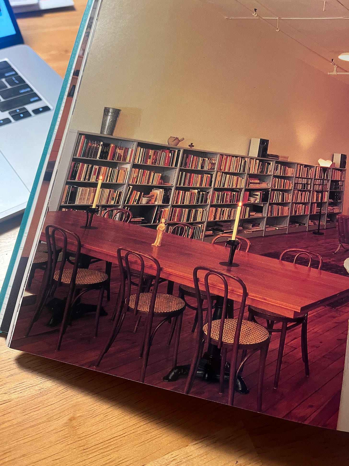
And, you know, the LOFT is very often Thoneted, too. A book was at our side as we’ve been writing… “NEW MODERN” by CARLA BREEZE … WHAT A NAME!…. we flung it open to see WTF-Thonetery might be in here. First page we f*cking landed on:
The Manhatt*n loft of painter Lauretta V., photographed by Ms. Breeze herself, circa 1995.
TWO COMMENTS:
We are thinking these candlest*cks Obakki just got in are kinda vibe-same as those on the table here. Plus: LOVE a 10-top dining situation, btw. Love when dining tables ARE NOT SHY.
Big love for SHOP QUARTERS (more Manhatt*n!!!!), but don’t u feel like this room here benefit from Thonet? Like, if this were a real room obvi and not a shop.
PHILIPPE B. AGAIN:
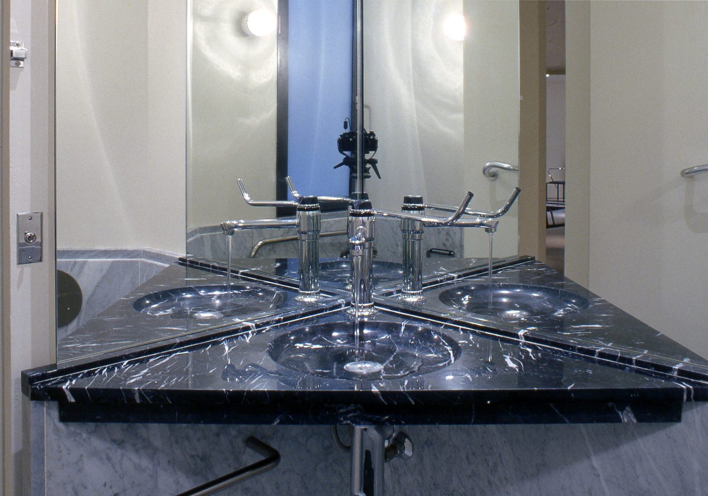
Onoe more crucial Philippe B. detail, this time not from the Tunisia place but from a 1987 N.Y. office, is CLASSIC PHILIPPE B. repetition.
i.e. REPETITION in the most confusing and unexpected way. NOT “ARK” SYMMETRY, wacky-playful “symmetry”:
This prada-diamond-shaped sink is pure chaos!!!! NO STRAIGHT-ON MIRROR!!!!! You f*cking choose Right of Left… he loves forcing you into an A/B choice! Which is kind of very ACTIVE for décor… Philippe B.’s presence lingers, directs u, effects u.
We would look Left because it’s our better side.
For CONTEXT, the office is very interesting, generally:
Those wall-bars have integrated lighting. This is, like, PRE-LED, so that’s kind of complicated?
NEWS-ish ASIDE:
You know who has integrated LED chrome bars rn? U.S.M., our dear pals!!!! Which is quite exciting, and they are used in that great stuff they did with sock-goddess Jenni Lee of COMME SI. The vanity is the TOPPEST TIER.
We went to see that stuff during its quickie display at the NUETRA V.D.L. house in Silver Lake the other day, with “FOR SCALE” pal Javier V.
Anyway, we’re fans of this cube-light-table, using those new integrated lights. Who the f*ck needs to waste precious table space for down-light lampery when you can just light up the table? Very disco.
JUST FOR FUN MORE PHILIPPE B.
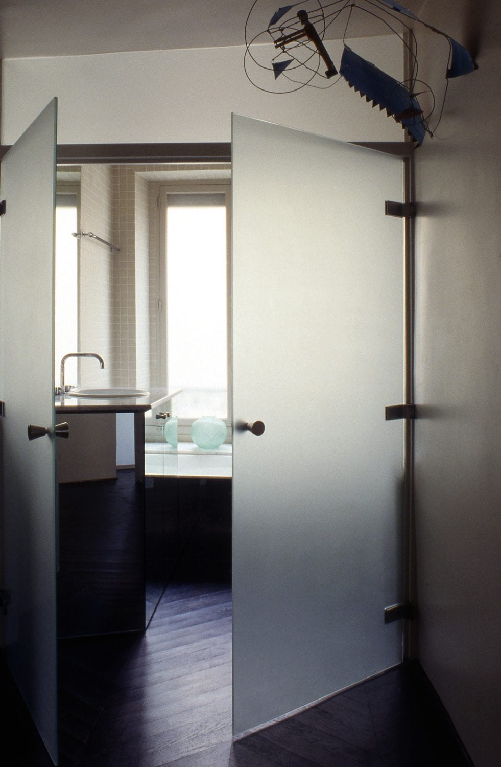
A 1986 Parisian apartment that could have been done like, TOMORROW, it’s so f*cking FRESH:
↑ Rarely think an orchid looks right; def does here.
↓ Rarely fans of a frosted-glass bathroom situations; exception:
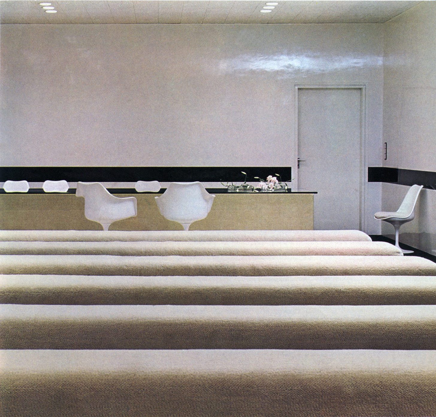
↓ LOOK AT THIS DAMN ROWS-OF-BENCHES SITUATION! at a 1972 Parisian suburb city hall (Mantes la Jolie – JOLIE, no sh*t!):
OK! END POINT:
Philippe, gosh. You’ve snagged us today!!!!!!!!!!! Just some really brilliant, kind of HEAVY-HANDED SIMPLICITIES, that keep things complex but also not really OVER-STUFFED.
Something to consider.
Until next week, LOVE AND GOOD LUCK
Someone else came up with this. We’re just sure if they want credit tho. If u r that person and u know who u r, then we r happy to shout from the mountain tops ur derisive “ark” comment



The city hall benches are making my heart hurt with longing.
that usm vanity *is* everything 😩