Dearest Snoops,
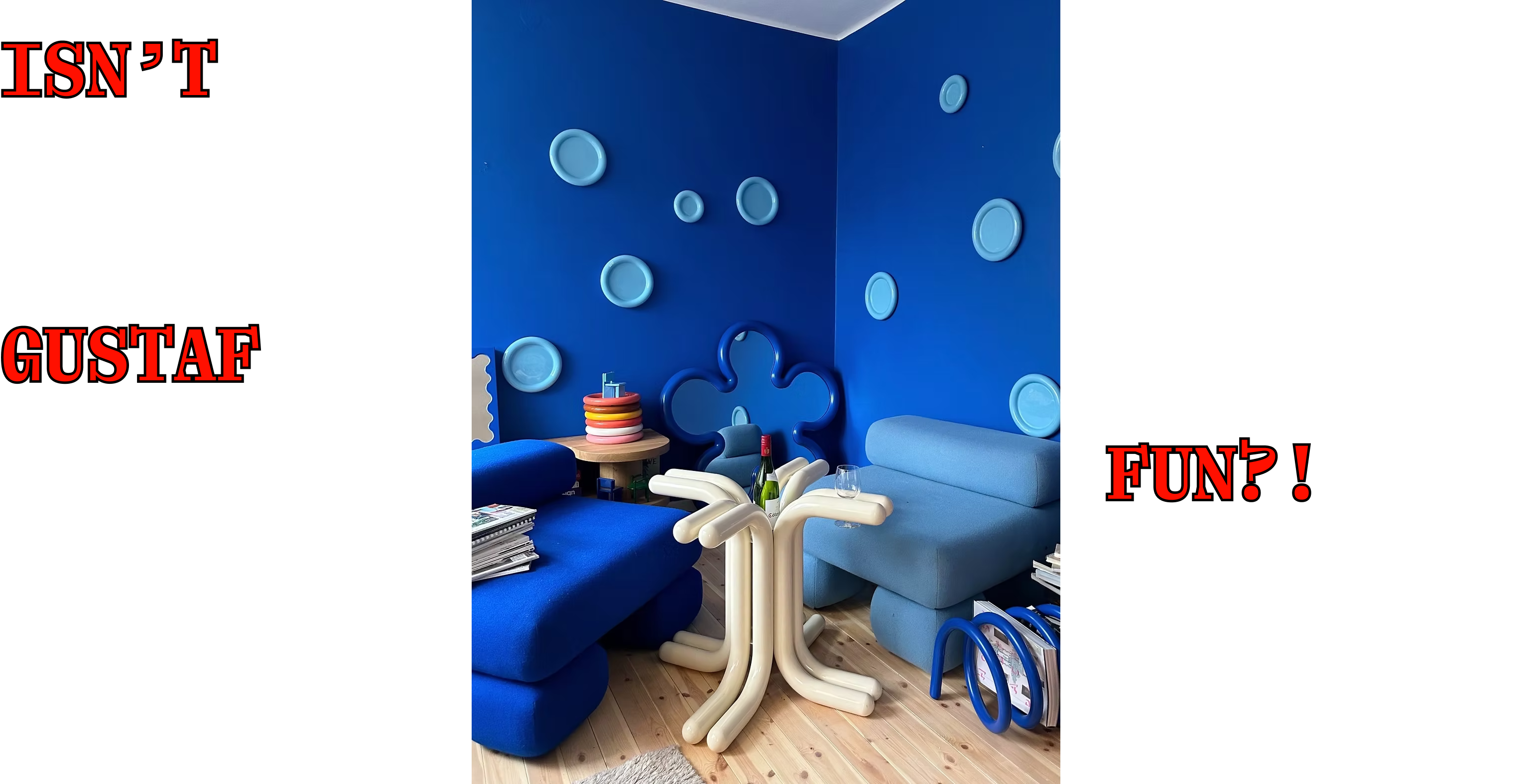
“FUN” is one of the décorworld’s most misinterpreted, and most inappropriately confined conjuring words. “FUN” is usually executed as quite a LOUD thing, as if all of us enjoy as “fun” the “BRIGHT” “PERKY” “GAME-ADJACENT” – it’s POP, it’s totally a slap in the face, it’s UNSUBTLE. It’s like, very Gustaf Westman.
And conversely, things that are punchy-perky we struggle to view as ‘SERIOUS’. (Is Gustaf W. also serious? Unsure.)
But, we’re tired of that FUN-interpretation, frankly. HEAVY reliance on novelty, and absolutely nothing exhausts itself (décor-wise) quicker than NOVELTY. (That Gustaf W. is a “wine table”. He just did a “meatball plate” for IKEA and it TIRES us.)
And so we aim here to present to you an alternative “FUN AESTHETIC” in its partial-place – because in fact, décor must be Fun. But also, f*ck novelty.
ALTERNATIVE APPROACH
We can’t bear to keep you in suspense, so rather unstrategically (from an editorial P.O.V.) we’ll summarize our thoughts:
You sort of hear a lot people say “DÉCOR SHOULD BE MORE FUN”. This is usually as a call to arms, but also a preamble to them introducing something they have done that they feel is “FUN”. And our message here is IT ALREADY IS VERY FUN. Just like, look around u ???? Don’t u see what we see?
DÉCOR FUN cannot just be about Gustaf-ian dopamine hits; what about those of us whose FUN and humor is “A WINK”, i.e. relies on a DOUBLE-TAKE-like energy in that you sort of have to like look twice, think twice, whatever
i.e. We need to (RE!-)learn the APPRECIATION OF SUBTLE FUN but also not treat that like some precious, intellectual pursuit either. But also,
the trick is also: we can’t let the uptight world of Décor making anything that is an ounce Smart or Intellectual into something precious and pretentious as they are so want to do!!!!!!!!!!
onwards…
CATEGORIES OF “DÉCOR-FUN”
There are three.
DOPAMINE: As covered, the kind of Gustaf W. camp; which is maybe also a lot the décorworld that has been “memphis-inspired” (but our p.o.v. is that versions of décor, especially what one might identify as a “MOVEMENT” sort of shouldn’t be so directly copied as some have been want to do; or like, that Luke Edward Hall does with Cocteau)
Not desirable — but oddly its this category of décormaker that big brands often really get off on. (Aside: IKEA, on the whole, has been pretty good at avoiding this, despite G.W. → we love Ilse Crawford; we love, love Teenage Engineering; etc.)OBVIOUS-INTELLECTUAL: Now, here we have already flipped the f*cking page, and we are in presence of some very top tier, long-lasting, culturally-adaptable décor that has some kind of RIGOR to it.
Examples:
Anything from GUFRAM or VERNER PANTON and also:
And OF COURSE a zillion others, but these are some we almost rANDOmlY plucked from the décorsphere to sort of illustrate that it’s like, BIG GESTURE, highly identifiable as “AN IDEA” that some designer LET’S HOPE was intending as at least IN-PART “FUN” and that also succeeded at that.
Two things about this category:
A. → You could totally think sort of intellectually about what the f*ck these things are doing. It doesn’t just seem to be like, some sort of surface-commercial play (see our analysis of the CEROLI in the context of the SEANCE)
B. → You are absolutely unlikely to have FULL DÉCORSCAPE just relying on the OBVIOUS-INTELLECTUAL; TOO MUCH STIMULUS!!!! *Honestly a mistake a LOT OF rich “design lovers” make!
There are sort of infinity examples of this.
THE ULTRA-FINE: THIS. IS. WHERE. WE. GET. EXCITED.
And, let’s us get into it via the IMPORTANT RESTAURANT’S IMPORTANT SCONCE that essentially *inspired us* to ponder the question of “FUN”, and the thrill of the ultra-fine, subtle, and HIGHLY NUANCED.
BISTROT PAUL CHÊNE LAURISON is a very good place to eat in PARIS, and we were there v. recently with “FOR SCALE” super-pal Sebastiaan G. (also very good at swimwear, that man is!) - and IN ANY CASE… the sconce! YYUUMM !
A ZOOM:
It has the vibe of a f*cking hyper-skilled craft project. This like folded-paper sort of super-simplicity. It’s LIGHT - literal and spiritual lightness. And, in the frame of a trad bistro, it plays a pretty significant role in making sense of why the staff are all young and hot, y’know? Like, there’s a different wavelength going on here.
As an ASIDE we could this very wonderful little proto-lamp situation via 22RE - gives PAUL CHÊNERY!:
Similar energy, non?
THE ULTRA-FINE FUN is a lot about this: CONTEXT and UP-CLOSE DETAIL. And it serves, for most (not us! ‘cause we notice!) as near-subliminal.
Speaking of THE FRENCH, THE OBLIST is sort of a master-seller at this level? Sort of a 1/2-tier below “GALLERY”, $price-wise$. If you stretch out your hand, you can maybe reach this?
Another is an example from recently deep-Internet investigations are these “EASY CHAIRS” being sold by (RE)APPROVED out of Belgium. (BTW their stock is v. good! SORT OF CONTEMPLATED GATEKEEPING (RE)APPROVED T.B.H.)
Everyone is scrambling for the just-the-right-amount-of-wear Wassily, and the Doctor’s Waiting Room vibe really remains quite a significant influence in the current homescape. But, those are like, some of the least FUN places known.
Instead, the ANON EASY CHAIR above has a lot going in, including Dangling Parts, that sort may - yes - have an initial impact, but the “FUN” elements are a slow reveal.
Now, another good example is EILEEN GRAY (in general) and her SATELLITE MIRROR, which she made for the guest bedroom for her Villa E-1027 (more !!!!FRANCE!!!!)
Sort of a “CLASSIC” mirror-with-light-with-smaller-more-intense-mirror. But, to sit with it, to call it by its name – it’s like, quite FUN – has that big-imagination energy of what it means for people to ponder celestial sh*t.
But all of this ignores one of the most FUN streaks of humanity and ergo also of décor, which is CAMP VALUE.
And, we introduce you to a new entrant, a lamp by the ever-excellent Melbourne duo of BMDO. If u r in town (their town) 15 Oct then u can see this at their upcoming show THE WORLD’S SMALLEST HORSE (a very CAMP name!):
Here we present to you an installation image because that’s what we’ve got (at OIGÅLL - a very good gallery-to-know):
The lasso-ery of this! It’s both very present, but it’s not like it’s dangling from some braided leather or something; it’s not “theme”. It’s double-take; it’s once-ya-know.
Again, you can sort of talk about each of these categories ad nauseam. And we shan’t be doing that.
But we SHALL introduce AN IMPORTANT NOTION:
That what is sort of “GREAT” about the ultra-fine FUN category is that u can sort of MAX IT OUT. As you descend from the dopamine-hit to ultra-fine, a homescape can handle increasingly more and more fun. PROPORTION-WISE
It’s why Max Radford’s home is so good:
Or Carla Venostra’s:
Or, to prove that they can be a little trad-elegant, this one by MARIE-ANNE DERVILLE:
Which also sort of speaks to how important CONTEXT AND ARRANGEMENT are in either make more or less apparent the FUN elements. But there’s a lot of great leg play in the Marie-Anne. They’re like little animals and s*x toys. It’s a ride!
“FUN” just like, doesn’t need to be a playhouse; u gotta sorta find the fun in this life. When it’s totally shoved down your throat all the time, it’s like, there’s no way for you to chill and DEEP PLEASURE in the Everywhere.
But that’s it for today, folks. C u next week.
Love and good luck,


Thank you for the Gustaf (obviously) but more specifically for the L.E. Hall observation
Do you feel that there's an element in today's LOUDLY ""FUN"" decor that's just existing for the clicks? They're not designed for use, but to be photographed and circulated online? On the fashion side, thinking of MSCHF's Big Red Boot