

PRESENTATIONISM ! How-not-to and How-to
An evisceration of M.A.D. in PARIS and also the best of what wasn't M.A.D.

Dear Snoops,
We made the unfortunate decision while in Paris to visit the MUSÉE DES ARTS DÉCORATIFS on Day One of its astonishingly boring-exhausting new exhibition of ART DECO Things. (WE HAVE WORDS FOR BÉNÉDICT GADY.) Even if taken individually some of the things were really Top Tier… how could they be so LOST?
Boring because you sort of shuffle around and learn very little because why the f*ck is museum text still so generic-lifeless?
some exhib pics on W.W.D. for whatever reason
Exhausting because the whole arrangement of the “exhibition”, with maybe a couple little glimmers of light, sort of gives off “arranged STORAGE ROOM”. It’s an aesthetic we sort of appreciate out in the wild, tbh, but not in the “MUSEUM PRESENTATION” context. So much f*cking energy goes into you squinting to blur out the exhibition design and like, hold your hands up like blinders for 90 minutes.
Throughout OTHER Parisian GALLOPS and JAUNTS, we in fact DID SEE and were REGULARLY REMINDED of what VERY GOOD DISPLAY can be. (Because little arrangements are actually what décor is about EXCLUSIVELY.) And, so experiencing the contrast has forced this essay.
TODAY:
Eviscerating M.A.D. (get your sh*t together M.A.D.!)
The SWAG dimensions of ARRANGEMENT and CONTEXT in recent Parisian (and other) displays
!!!Homescapes lessons!!!
May we begin René Herbst (of Paris, of course!!! R.I.P. 1982), and a chair of his that was on display at M.A.D.
You know this chair (BELOW - from 1929), probably, because it’s been very Hip of late – having also had a little “Moment” in 1982 (i.e. the year Herbst died) being plucked from otherwise-obscurity and reproduced by Ecart (of PARIS, of course!!!) - dead people’s sh*t is considered More Exciting as u know.
IN ANY CASE, YES YOU’VE SEEN IT BUT, you’ve probably never seen it look SO F*CKING TERRIBLE:
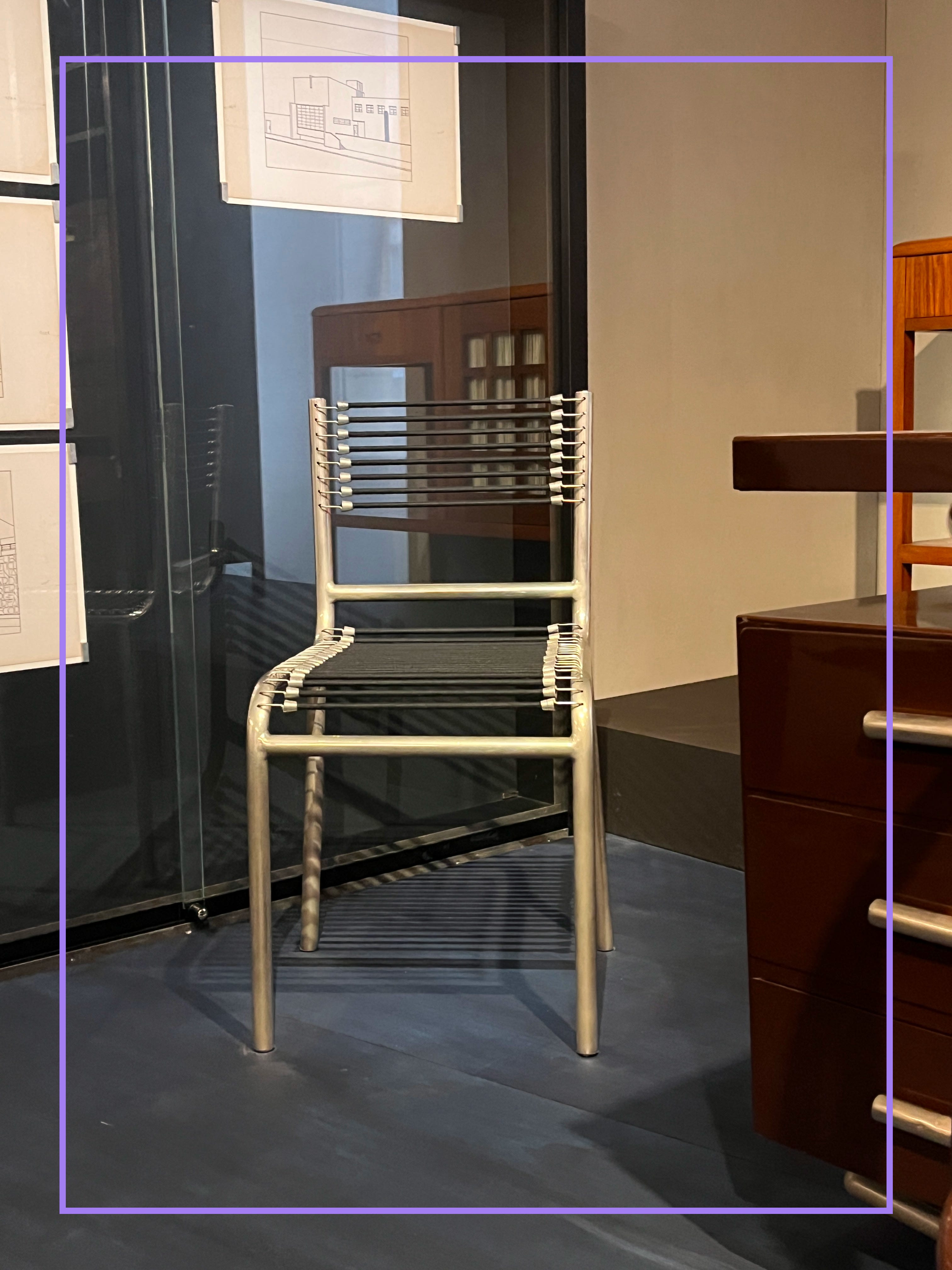
YIKES. Like, it has zero f*cking gravitas, it appears random and swagless, just some chair next to… nothing important. This IS a swaggy chair though – and this is how it’s treated?! Does M.A.D. – a “leading museum” – not want to communicate how much THIS chair in particular has sort of LIVED ON and continues to bring Art Deco into the lives of Swaggy décorheads the world over?
Now, our little squadrette of M.A.D.-goers → “FOR SCALE” super-pals Gillian S., Sarah N., and Max T. ← just as you, dear reader, do know how absolutely cute and even STILL-“EDGY” this chair can be. Even if it’s been cycled through popularity twice in the last century.
Okay.
Now.
Let us remind u nonetheless of how BETTER it could have been at M.A.D.:
Let us take a look at Ecart – re-editions-of-furniture folks
Ecart doesn’t do Herbst anymore; but they do still do its cousin, a version by Michel Dufet, who was hot on René H.’s heels (his chair from 1930). For laughs, let’s just do a side-by-side with how Ecart shows us Dufet:
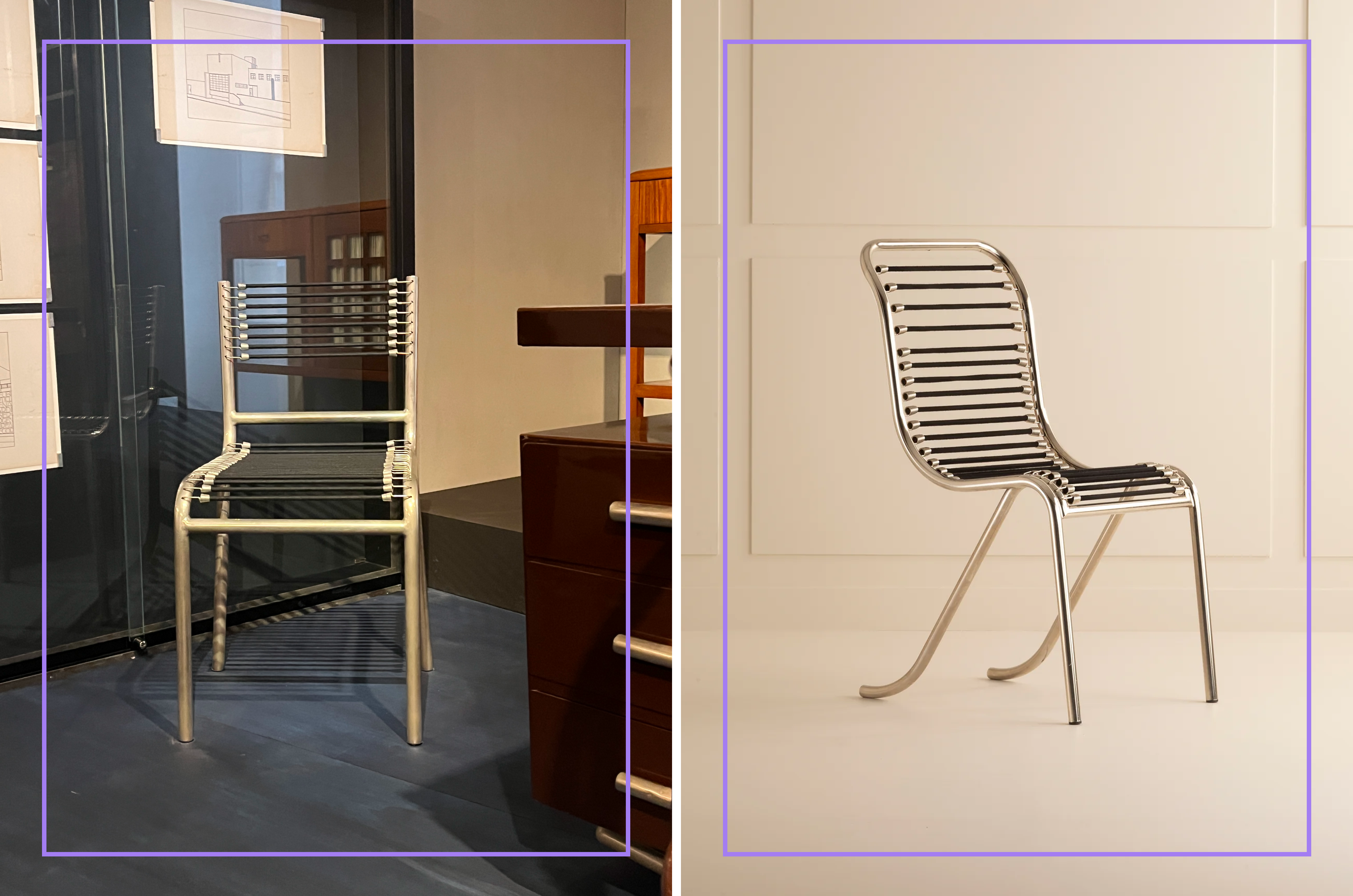
We have NEVER used an em*ji in “FOR SCALE” before, but: 😂 !
The f*cking curators should have called Ecart.
Here (below) is Ecart founder ANDRÉE PUTMAN in a room she’d arranged with some Herbst also showing how, like, they can look VERY APPEALING even when not just isolated in some great Ecart-ian product shot –– AND! then also an Ecart gallery promo where u even get some more Herbst showing its kind of shadowy-allure possibilities:
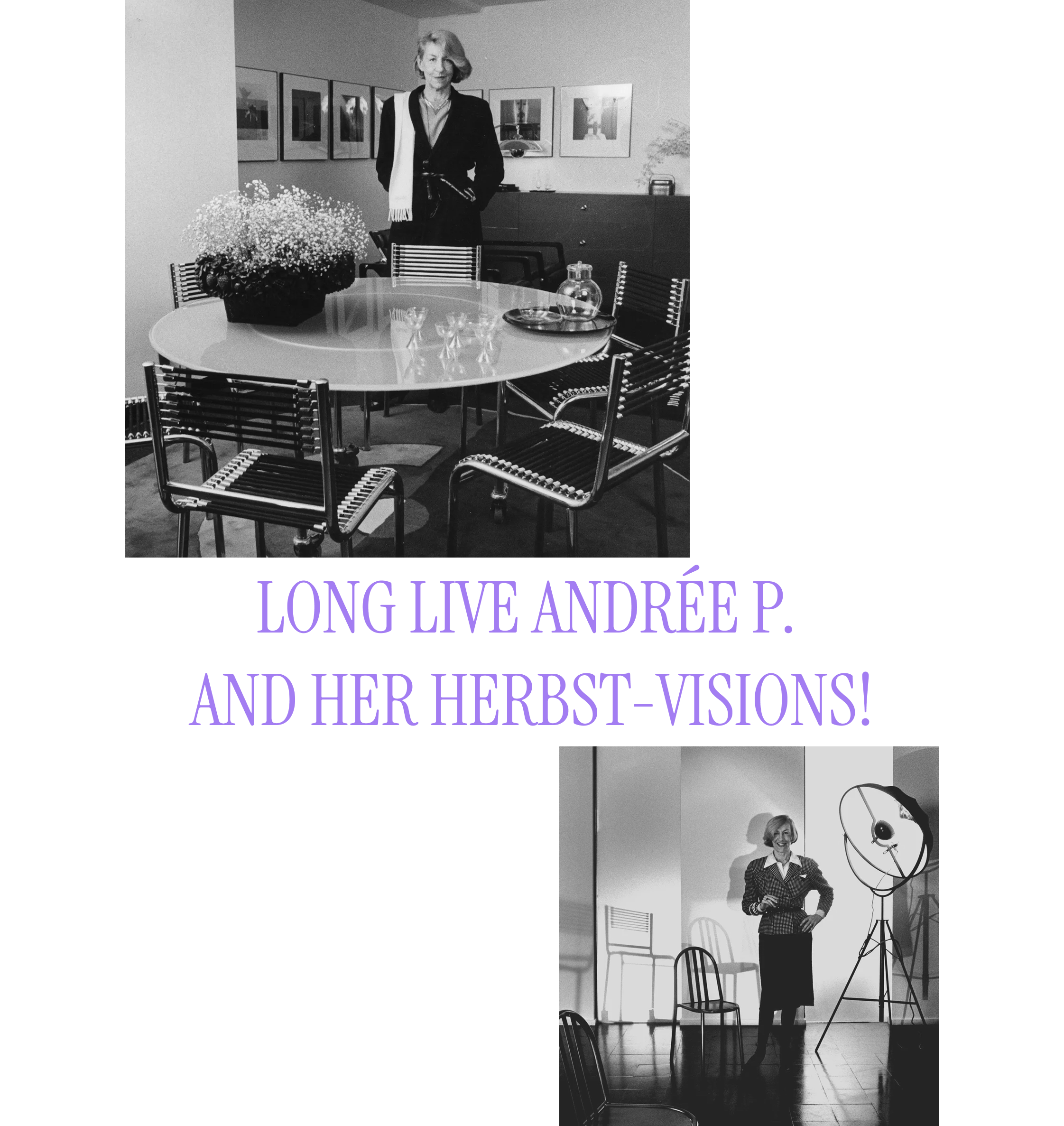
She knew how to make furniture FEEL VERY RELEVANT!
ALL THIS TO SAY - what is sort of incredible about ART DECO is how still f*cking way modern it feels. And this godd*mn exhibition did nothing if not to make it all seem so f*cking dusty and dated.
Even when they tried to bring it “into the present”-ish, via décor-dude Jacques Grange (lol his IG handle is @beaujolais1944), the energy was just “Jacques G.’s STORAGE ROOM” – just sort of on some steps. All TOTALLY not I.D.’d, all just seemingly arranged without much consideration of their interactions with one another - or with anything contemporary. And we’re supposed to think THIS stuff has Today Relevance?:
What exactly is being said here? Like “Hi, I’m Jacques G. and I have a bunch of STUFF!!!!” ? (B.T.W. then the next room was Kimonos… which was another just sort of random Art Deco story element, as this was.)
You’re ASKED FOR SO MUCH from this f*cking show – like, you want me to imagine how and in what CONTEXTS these bits are seen as exciting and relevant to Jacques G.? Few have this sort of imagination.
Why didn’t they……… (next slide please!):
! SO !
As a little aside, you know what’s a BETTER way to show that ART DECO has this amazing range in that it sort of INVISIBLY can stitch itself into, like, 1980s, 2020s, or in this case 2013 – to just show how Décorminds use something like Jean-Michel Frank furniture (which is also from the ArtDecosphere and as also current on display at M.A.D.) in, say, the homescape of Giorgio Armani, décorated by Peter Marino:
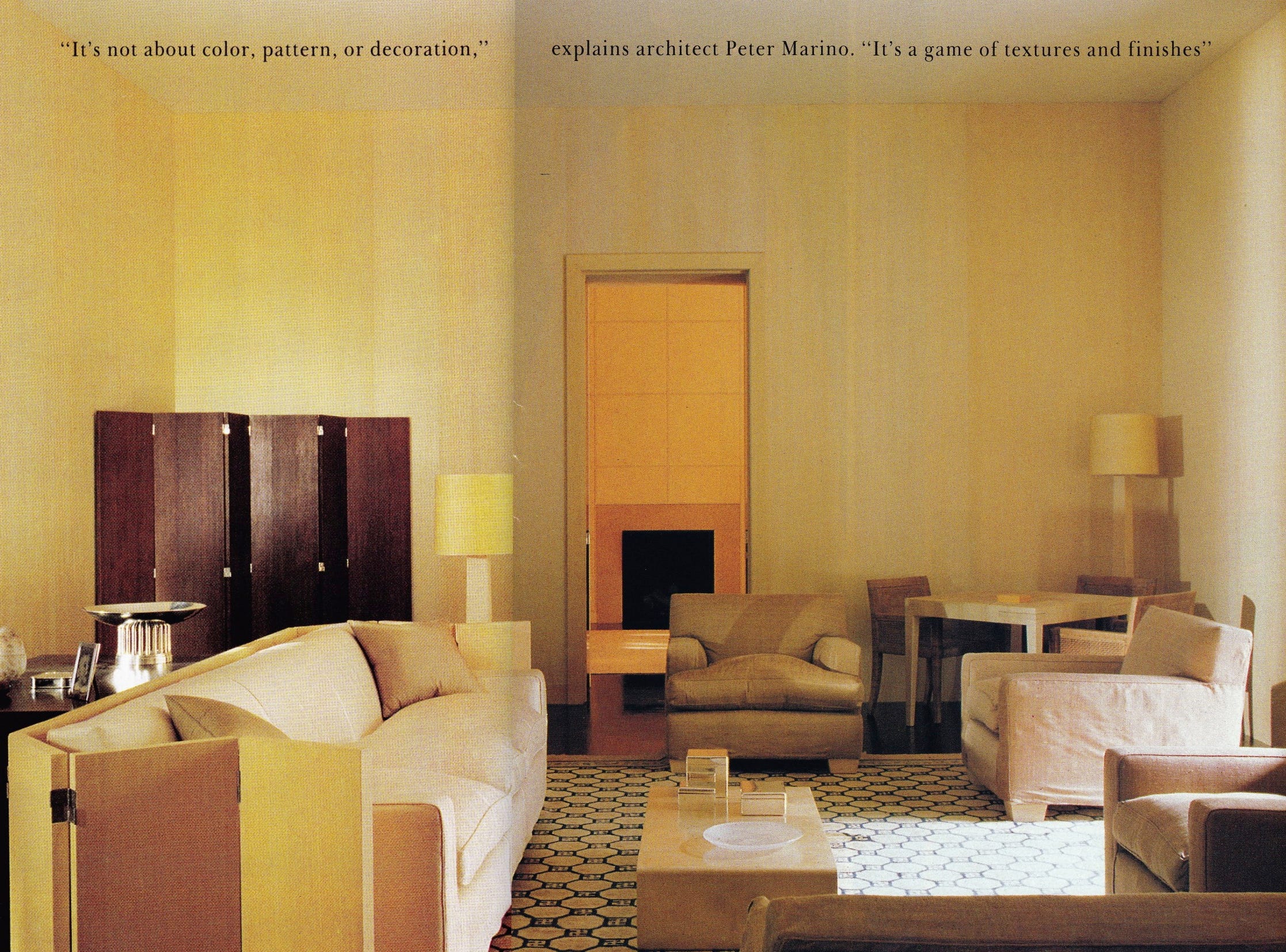
THERE WE GO. Art Deco brought forward. (There are like, 80 billion chic as f*ck examples we could have used.)
Yum. We love ARTY D.!
And frankly, even in its CONTEXT OF THE TIME – where M.A.D. totally leans more into Deco as like “the next step after Art Nouveau” (PAST FOCUS), it seems totally uninterested in the fact that it is PRE-MODERN and is also like way more interesting to see the Deco-heads as TOTALLY SETTING THE TONE for alllllll the f*cking shit we have seen for a f*cking century.
FOR EXAMPLE, one such Deco-head PIERRE CHAREAU worked together with Bernard BIJVOET (obviously Dutch; an archit*ct) on the h*rny-for-next MAISON DE VERRE (more/always PARIS!!). Table circled (squared, really!) was at the M.A.D. and looked sort of Regular there, but here it looks kind of tension-building:
At M.A.D. you saw it as something sort of “nice”, but HERE you sort of see it as like “oh, it’s sort of mechanical-moveable – what was he exploring?”, and less like “oh, it’s like lady’s little fan.” OR WHATEVER. Literally there are academic papers on this furniture-context combo - we SHAN’T be reading them tho; not yet.
The point: DÉCOR OBJECTS really come ALIVE in CONTEXT !!! The crucial-est.
* Anyway *
M.A.D. PRESENTATION AESTHETIC:
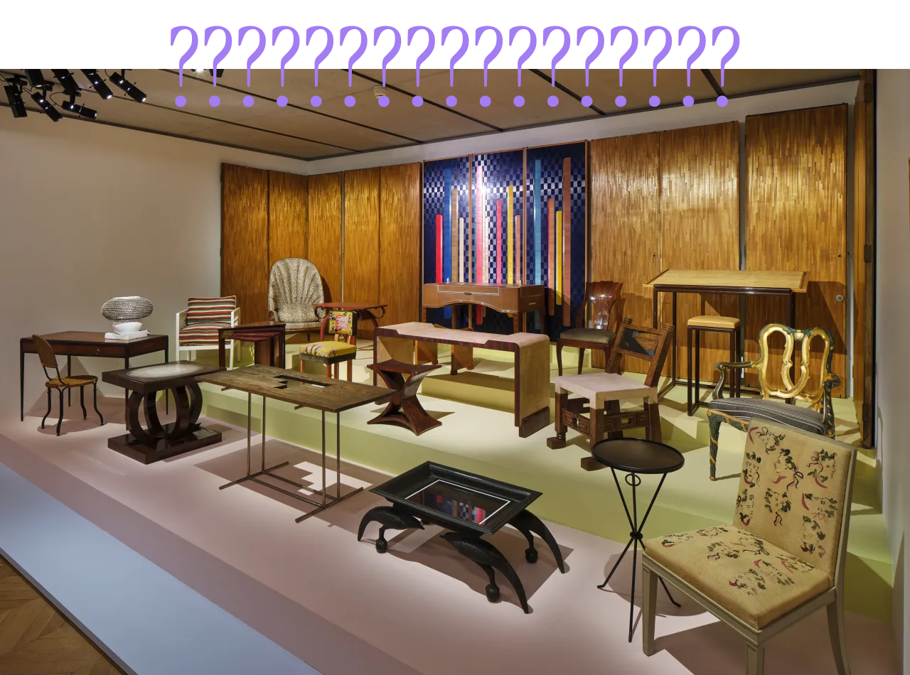
“FURNITURE ORPHANAGE”
Just seemed simply like these super-duper little décor children were not yet sort of feeling “at home” … like, a little just massed together, but it didn’t really seem CELEBRATORY.
THE PRACTICAL HOMESCAPE PHILOSOPHY
Take a look at these pre-MODERN-but-still-you-can-consider-them-on-the-edge-of-Art-Deco-(stay-with-us-on-this) chairs by Robert MALLET-STEVEN used so utterly FRESHLY in London’s ALSO SUPER FRESH (as in just opened) SUPERNOVA burger palace by !!SARITA POSADA!!:
Yes, again, that chair is on the ‘afterdeco’ edge of things, but for the sake of this argument - HELLO!
(Also, sort of a tatami mat energy to those walls, yeah??)
THE POINT:
Ok this wasn’t a ‘home’ - which is what we’re here to talk about, ostensibly – but Supernova is what we wanted to use to make a point, which is:
There is ABSOLUTELY the spirit within any décor object that wishes to be seen as (1) absolutely new and décor-zhooshy.
Sarita P. is a clear example of allowing for OBJECT REJUVENATION. If there is a Thing you feel compelled to use or display, you have a DUTY to ensure it feels ALIVE and also PART OF THE FAMILY.
And, if you’re very lucky you also make a few things sort of leap out of “Plain” and make them feel SUPER SPECIAL - as with these Robert M.-S. chairs frankly. Don’t they seem like, especially chic?
(Also you’ll maybe have noted they were in that Andrée P. promo shot image, too.)
RECENT DÉCOR PRESENTATIONS A.K.A. DISPLAYFOLK M.A.D. SHOULD SPEAK TO
Speaking so much of the PRESENTATION-ish of things, there were some extremely GOOD EXAMPLES in Paris (we share 2) – and then we’re gonna throw one from N.Y.C. in the mix too.
1. CØR + MONUMENT + HAROLD MOLLET
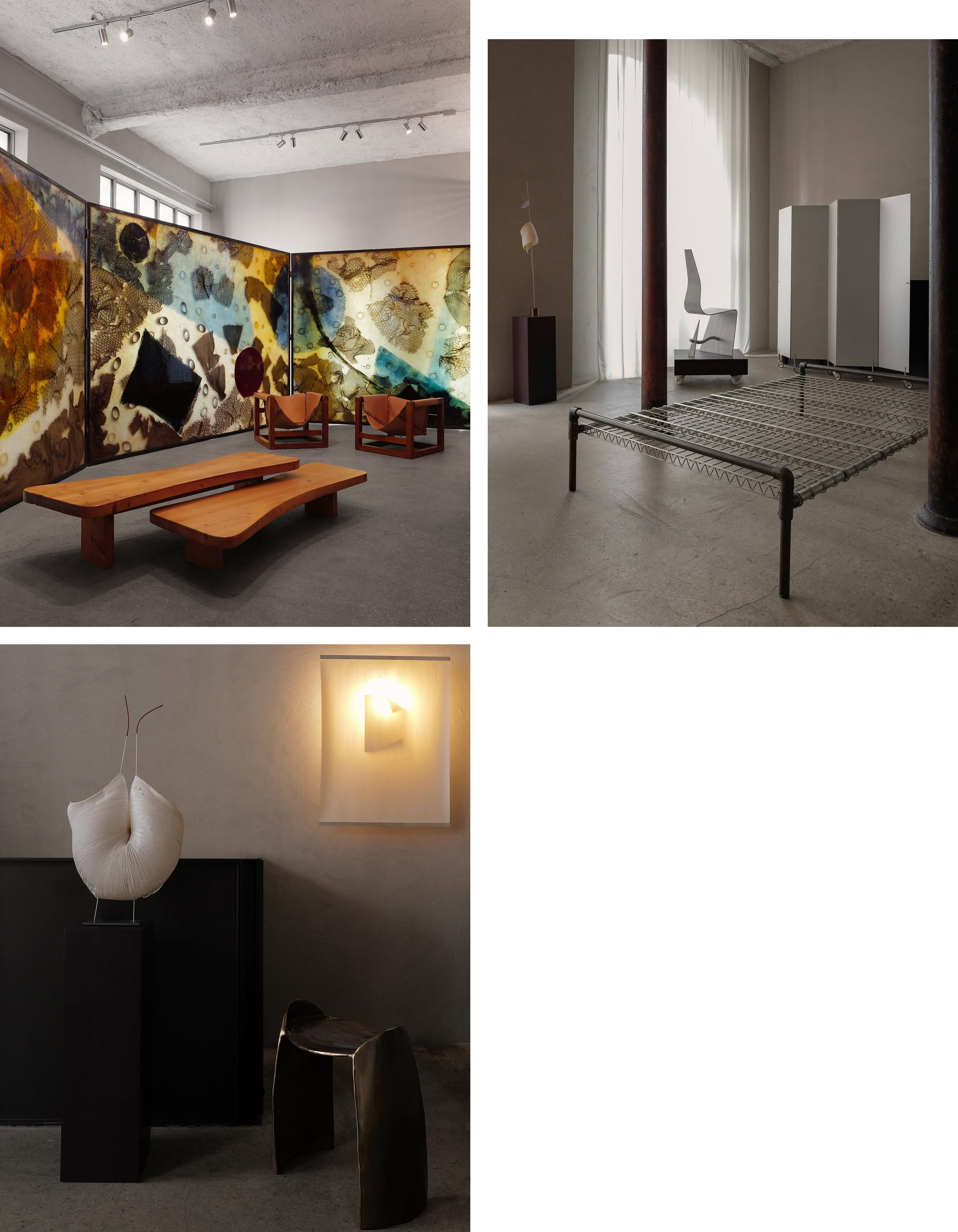
Exceptionally relaxing tbh for some things that are like hyper-industrial or sort of outlandishly over-sized or others which drugged-night-at-Berghain-inspired (not-pictured). And that’s a credit to ARRANGEMENTS and PARTICULAR MIX and also - gasp!!!! don’t tell M.A.D. - letting shit sort of BREATHE. It’s the advantage of the minimal-adjacent, everything DOES seem calmer.
2. GALERIE SARDINE at a pvt home
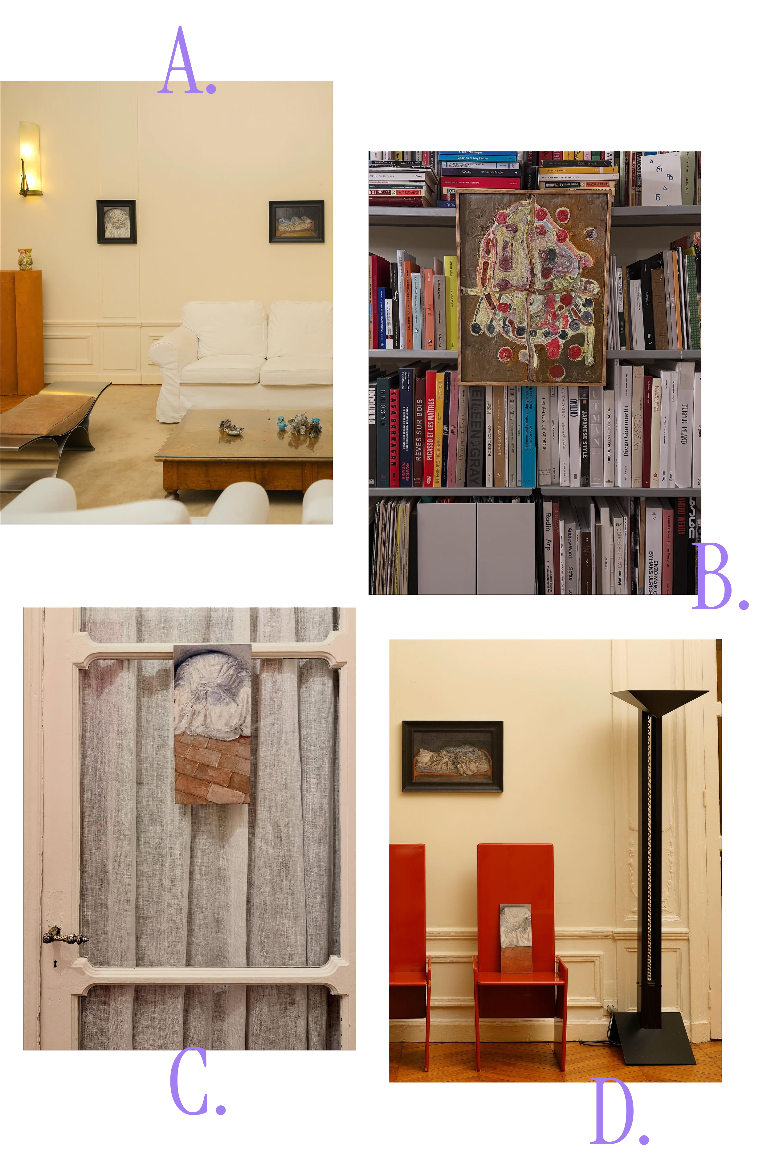
(a) paintings of chairs above a chair; (b) abstract paintings on top of books (books being where people try and like be the least abstract as possible usually, or like, attempt to make sense of the abstract); (c) paintings of chairs on doors, WHY NOT! f*ck walls; (d) paintings of chairs ON chairs as Display Zone – !!!meta!!!
All just very good. And it’s like, OK: ur making us pay attention. Y’know? These little guys just MAKING THEMSELVES KNOWN.
2. N.Y.C. → SWEETERFAT does PESCE
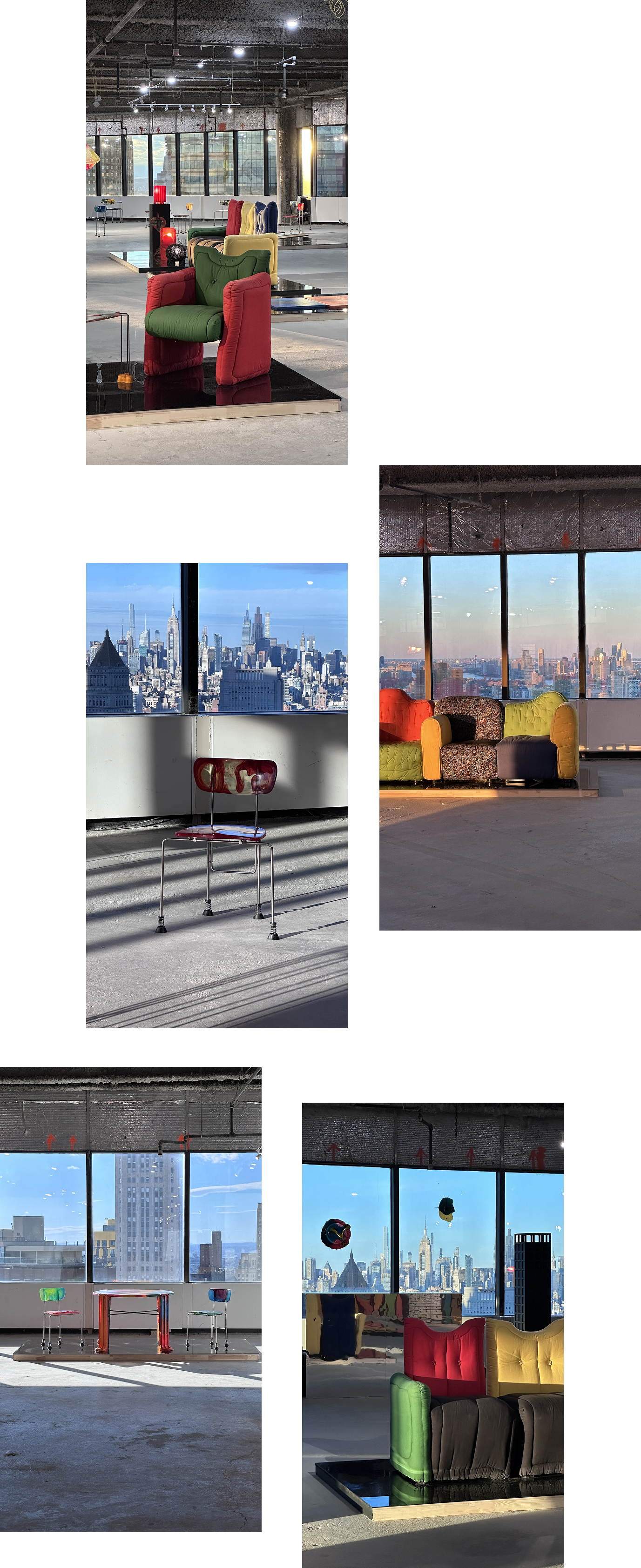
Again, we’re talking SPACE TO BREATHE, y’know? And also that f*cking skyline! Dunno why that sort of immediately tells u what you need about all this “Gaetano Pesce does Chiat/Day office” (1994) stuff. (Exhib is called RETURN TO THE OFFICE - please investigate!)
THE POINT IS — a very good thing is an EVEN BETTER THING when it place/setting/context and thing have a vibe between them! This is sort of like prime example.
IF YOU ARE READING THIS TODAY (MONDAY OCT 28 2025) YOU CAN STILL GO SEE THIS. LAST DAY ALERT. 180 MAIDEN LANE. (WHERE CHIAT/DAY REALLY WAS.)
IT REALLY IS EXCEPTIONAL.
Ok, well, as per, we have just sort of exhausted ourselves. Favorite exhibs on rn? Tell us.
Until next time, love and good luck

You nailed it with “storage room energy”.
Please keep the Paris updates a-coming!