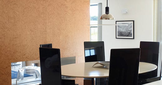
Do you know MAX RADFORD and his top-tier furniture-selling life in London, known to the world as “the MAX RADFORD GALLERY”? Well, we believe you should. The reason are:
FOR GENERAL INSPIRATION: We’re very obsessed by brainy people with thoughtful taste, and M.R. seems to us to be encyclopedic – yet that drags some people down. Not the case here; here it is a lift. Here he is on I.G.
FOR A RECENT DÉCOR PROJECT IN PARTICULAR: Despite generally preferring ones-own-design’ed places, he just finished a décor project in the United Kingdom and we are going to fixate on that here and now. It has many thrilling lessons for us (and ergo for you)
A LITTLE PREVIEW:
We love a WOOD, we love a BLUE, we love a BUTTER-COLORED DRAPE… so it ticks a lot of boxes for us, personally.
YES, this is very “PUT TOGETHER”, not some grown-over-time situation, as we typically praise. And, it is put together with an intimidating level of skill, i.e. “professional”. AND YET, there are some excellent take-aways that serve any and all.
A LITTLE AGENDA FOR TODAY:
BEST ELEMENTS AND BEST LESSONS, with identifications of some specific bits of furniture
LEAST FAVORITE THING, not pictured because they aren’t in this house but identified by MAX
MAJOR DÉCOR INSPIRATION SOURCE, in the form of books
BEFORE WE GET GOING, however, let’s obviously say hello to MAX and some of what he posts on INSTAGR*M for further evidence of his interiors vibe. N.B. this is really OUR LIKES of what HE LIKES, and so is representative of FOR SCALE’s p.o.v. on the RADFORD AESTHETIC. Ultimately the tension we admire in the décor Max selects is “HYPER SPECIFIC” + “SMATTERING OF THINGS” (in terms of arrangement).
Max and stuff he likes:
Desperately wish we could pull off long braids! He does is exceptionally well.
FOR SCALE is a reader-supported publication. To receive new posts and support my work, consider becoming a free or paid subscriber.
ONWARDS TO STYLE NOTES:
1. A ROOM OF A SINGLE COLOR
Too often, we exist in a straight jacket of PRE-DETERMINED COLOR. For example, a sage kitchen. Or, the is the bathroom, which is nearlyunvaryingly WHITE. High or low end, various continents, etc. Which, to be honest, we love.
AND YET, a BATHROOM OF A DIFFERENT COLOR has super-distinct charm. It’s a real investment to make it happen, because the world is engineered for “ALL-WHITE BATHROOM”. To escape this shows you to be a Bold Décorator. And there’s a framework for that:
THREE C’s OF THE BOLD DÉCORATOR:
“CHOICE” (i.e. a selection that will be questioned by others, i.e. “a choice“ i.e. “wow, blue, that was a choice!” )
CONVICTION (i.e. belief in one’s choice, and ability to defend)
CHARACTERISTIC (both in the correct sense of “Oh, that’s such a MAX RADFORD”, but in the non-exactly-correct sense of IT HAS F*CKING CHARACTER)
The piece of culture that introduced the world to “THINGS CAN BE COLORS THEY SHOULDN’T BE” is in fact 1939’s WIZARD OF OZ, where “A HORSE OF A DIFFERENT COLOR” laid it out pretty plainly. Same horse + new, singular color = a great thrill.
If it can be done with a horse, it can be done with a room.
Max employs single-colordom thrice, include two unexpected choices and one expected choice, which we’ll still defend. HERE ARE EXAMPLES OF THE RADFORD COLORWAY:
Sure, a kind of “ELEPHANT’S WHISPER”-ish grey-white is more 'expected’, but the twist is that, when you do FULL RED BED, and FULL BLUE BATHROOM, then the grey-white takes on new meaning. A delightful result of what we like to call “THE BROADER CONTEXT” (something we generally like to ignore in society).
Let's give you the blue bathroom on its own, simply because it is HEAVENLY:
LITERALLY!
ASIDE
MAX RADFORD also collaborated with CAKE (an arch*tecture firm) to produce an all-red bathroom for London cocktail lounge SOMA. And, in a total tangent, CAKE also collaborated with agency-of-agencies “ASK US FOR IDEAS” for their London offices which are HERE and are as close to flawless for a place where one has to work as can be.
WHY ROOMS OF A SINGLE COLOR?
To be enveloped in a single color is the ONLY possible way to experience theories of color in ACTION. The typical room is a RAINBOW ROOM – there is something of everything in it. And, frankly, that’s very difficult to steer away from.
Our most favorite color theorist is GOETHE, who says of blue:
“AS YELLOW IS ALWAYS ACCOMPANIED BY LIGHT, SO IT MAY BE THAT BLUE STILL BRINGS A PRINCIPLE OF DARKNESS”, and that it is a “stimulating negation”, ergo…
“ITS APPEARANCE, THEN, IS A KIND OF CONTRACTION BETWEEN EXCITEMENT AND REPOSE.”
And isn’t “BATHROOM” really a great place to incite both excitement and repose?
A ROOM OF A SINGLE COLOR also shows the great effect of making one simple choice to start (i.e. BATHROOM = BLUE) and then making 1,000 excrutiating decisions after to support that (i.e. “what kind of blue?” “what in here can we get away with being NOT blue?” etc.)
And isn’t this just like life? You make one decision, and then you have to constantly just go along with that even if it’d be so much easier not to.
2. HALLWAYS ACCORDING TO “K.I.S.S.”
K.I.S.S. is the simple BABY BOOMER GENERATION-devised lesson of “KEEP IT SIMPLE STUPID” and for us, this is the future of HALLWAYS. Please consider removing ‘gallery walls’.
Here is an immaculate, empty hallway:
TWA flight center hallway, ‘62, New York City, by Mr EERO SAARINEN (and who remembers what we say about names with so many vowels? YES, that’s right: he’s FINNISH)
And here is a RADFORDian hallway:
We recently came across some post on Inst*gram about how hallways were a “WASTE OF SPACE”, but we prefer to view them as A SHORT DOMESTIC COMMUTE. Much like a commute for work, if they aren’t absurdly long as to be painful, then they are very useful a creating a nice moment for your brain to switch from one mode to another. Know what we mean? Kitchen to bedroom… bathroom to guest-filled living room. You want to be able to reset, and not just open a door into a radically different space.
And, this RADFORD hallway is very SIMPLE, but a good example of how that still needn’t be SAARINEN EMPTY to feel "EMPTY ENOUGH”. Max let’s a little bit of peek-a-boo be played.
3. EXCEPTIONAL LAMPAGE
There a few places in this house which also give us great hope that, at night, the light is GOLDILOCKS, i.e. just right.
They include two quite playful things:
Very un-harsh, the light mediated as it is by white fabric. We adore that.
And, not pictured, but present in the house is a lamp that MAX refers to as one of his favorite things ever, which is also a favorite thing IN HIS OWN HOUSE, i.e. The E.J.R Barnes Sail Lamp:
This, in contrast, IS quite harsh. Seems like it could slice you. And yet, something about this phone-cord-style power cord really takes that down several notches. We approve.
OTHER FAVORITE THINGS OF MAX:
“My favourite things in this project have to be: the Takama Kazuhide Dining Chairs; they have always been a favorite since I got properly into late 20th Century design. Also the Amelia Stevens "A Table Without Qualities - Plinth" in the pool bathroom. It just feels like such a successful design in its light structure but strong stance.”
“Bouclé - particularly off-white ones - when will it end!!!
There you have it.
BONUS: PARTY POTENTIAL
Truly the ONLY use of a disco ball we’ve seen and not been repelled by. How’d he do it?!
USEFUL RESOURCES
We always, ALWAYS appreciate tips on books to flip through to expose us to tidbits of décor and spark our brain fires. For Max, it is this:
“I've spent a lot of time buying and trawling through books on design and interiors, as you have seen. I do still remember first coming across a series of books called "The International Design YearBook". They start in the mid 80s and are a real mine of information for particular pieces of the time. They also have guest editors such as Ron Arad or Phillipe Starck, which seems to add to the mythology of them!
I've just transitioned to Magazines instead of books and have 2 piles my height that i'm yet to start going though...”
We love a serial; we love a magazine and the magazine-adjacent.
You can look at Max’s IG for all the pictures of this place, as we feel that despite this long post, we’ve just skimmed it. Go and ogle.
But for now, we have - as per - really exhausted ourselves and must sign off until THURSDAY where we have the inimitable DUNG NGO and super-sellers RARIFY showing us the best used things they’ve found on the Intern*t.
Until then, LOVE AND GOOD LUCK
FOR SCALE is a reader-supported publication. To receive new posts and support my work, consider becoming a free or paid subscriber.
I've just discovered your Substack... and I'm enjoying chuckling and learning my way through your extremely opinionated posts! :-D. Opinions in design are wonderful - keeps things interesting and in your case makes for an amusing (and informative) read. I look forward to more, and I will have a browse through more prior posts. From this post - my little discovery was the lamps - the fabric sail one is super - so many ideas going through my head now, none of which include a white sail, but it's great starting point. The umbrella one is whimsical and fun, and again ... makes my head swim with the colour and pattern possibilities.
A VERY VERY GOOD HOUSE TO OGLE
I've just discovered your Substack... and I'm enjoying chuckling and learning my way through your extremely opinionated posts! :-D. Opinions in design are wonderful - keeps things interesting and in your case makes for an amusing (and informative) read. I look forward to more, and I will have a browse through more prior posts. From this post - my little discovery was the lamps - the fabric sail one is super - so many ideas going through my head now, none of which include a white sail, but it's great starting point. The umbrella one is whimsical and fun, and again ... makes my head swim with the colour and pattern possibilities.